Wrestlemanina 29 logo exploratory
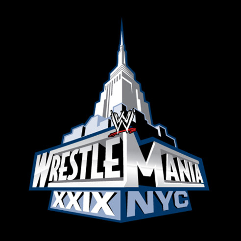
Original perspective logo concept.
Beginning construction of the logo with a central building block base lock up perspective.
Logo with a fully rendered buildings.
Simplified buildings with a more graphic representation.
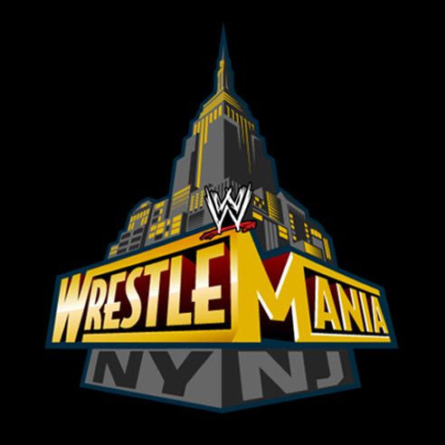
Logo "The Gotham City" color scheme.

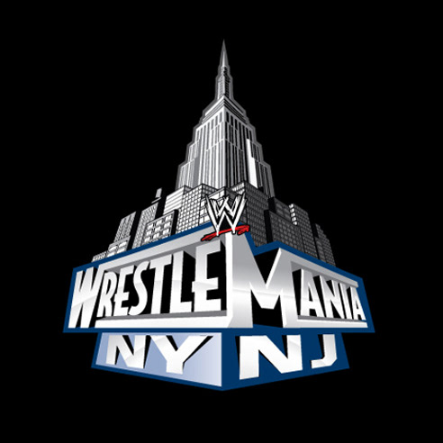
Logo with a more "Metropolitan" color scheme.
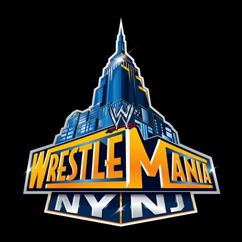
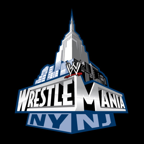
The final logo: Wrestlemania NY / NJ